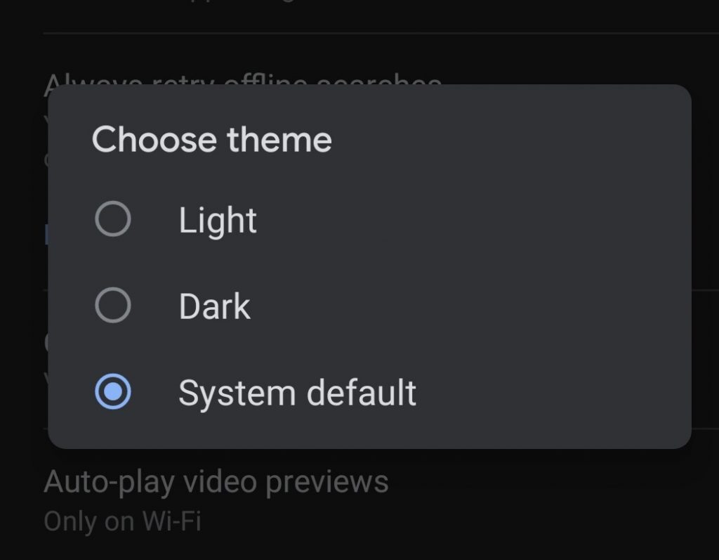
At this point, it seems like common sense to just give text-heavy apps a dark mode. Beyond the fact that it just places less strain on your eyes, there’s something undeniably cool about browsing Twitter through the lens of darkness. That got far edgier than we intended, sometimes we can’t help ourselves. Dark mode brings out the edge in us all and now it’s finally doing the same for Google Search.
Whilst it has been in beta for some time now, all Google Search users will finally be able to switch between dark and light modes in the app. Rolling out today for most top-of-the-range phones, the update will enable users running compatible software to manually or automatically switch Google Search between light and dark mode. By compatible software, we just mean the newer versions of Android and iOS. You’ll need Android 10 and iOS 13 to get the most gimmicky yet cool feature of the app but most modern software will receive the update. Once you’ve got that downloaded, the rest of the process should be ridiculously simple.

What’s really cool about Google Search’s dark mode is that once the update has installed, the app will automatically detect your device’s display settings and switch it to the mode that best fits the theme. Which is really simple but also super cool? Of course, this will only be the case with the most up-to-date software, so older versions will probably just require users to manually switch between light and dark mode. Still, that’s hardly an issue considering it’s just a simple flip of a button in the app itself.
Finally, we’ll be able to bravely venture to the first page of Google and ultimately give up on whatever we were searching for without our eyes feeling a little burn the whole time.
(Source: Engadget)


