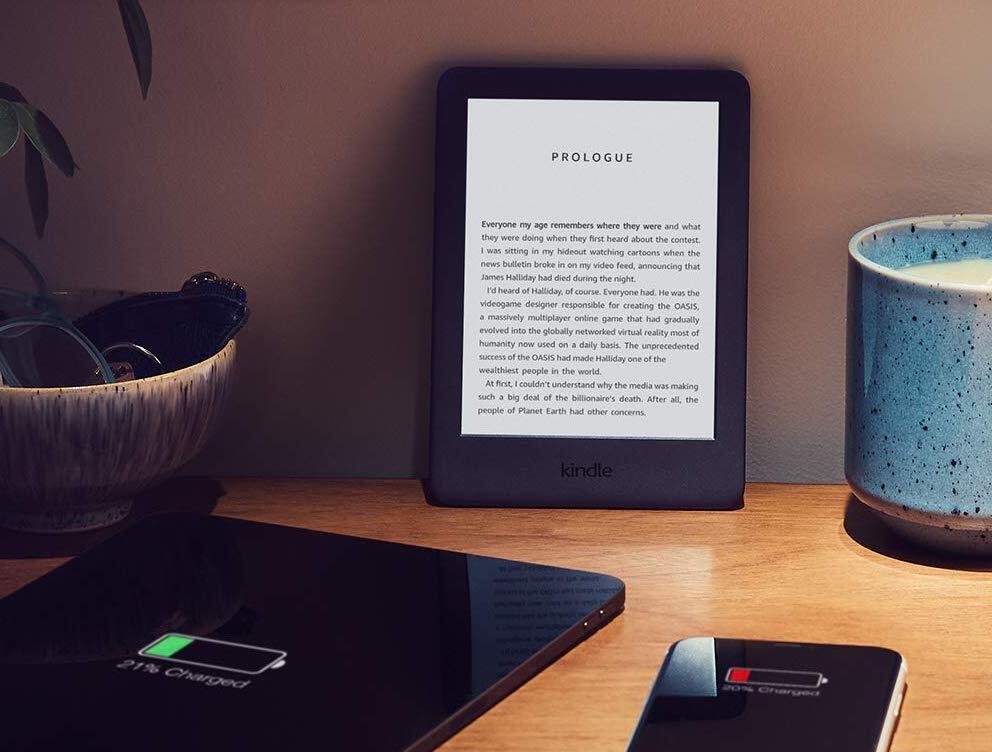
‘If it’s not broken, why fix it’ seems to be Amazon’s approach to the user interface (UI) for its Kindle range of e-readers. The incredibly well-loved (in the Stuff offices, at least) device only rarely sees an update to how it functions on a software level. So when something new turns up, it’s worth paying attention.
Something new from the Amazon
If you’re fond of nothing more than a good (digital) book, then the change in your Kindle’s general look and feel is something you’re going to be intensely interested in. The folks over at Ars Technica spotted Amazon’s new update, which has been in the works for some time, and has broken down what’s incoming.
The major changes involve navigating on your Kindle and, since that’s all you really do with it (besides reading things), that’s rather important. How users access quick settings has been tweaked to resemble using an Android smartphone. Instead of tapping a button, users now swipe down from the top of the screen to access quick settings.
Elsewhere, UI elements have changed and some menu items have been made smaller. (but remain more or less the same), while the web browser is no longer ‘experimental’ and your device will now show you which generation you’re using — once the update is installed. Pity you need to know which generation hardware you’re running before Amazon’s update is installed, right?
If you’re using an 8th gen Kindle or better, 7th gen Paperwhite (or the excellent 10th gen version), or a Kindle Oasis, you’re eligible for the update. But it’ll only install a) when it’s available and b) when you’ve got your Kindle both c) connected to WiFi and d) connected to a charger.


