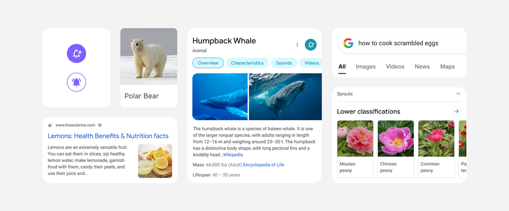
We’re betting ‘let me Google it quickly’ has become a common phrase in your daily conversation. It’s a great way to debunk myths and back up your story when arguing with a stubborn family member. And most of the time, the Googling’s done from your mobile phone.
Now, the Google mobile experience has been slightly streamlined, so you’ll have the facts far quicker than before. The update brings along some nifty interface changes that should make Googling overall a more pleasant experience.
The ‘new’ Google mobile
The results pages now display edge-to-edge with larger text, fewer shadows and more purposeful use of colour to illustrate what’s important. According to Google, users should be able to spot what they’re looking for faster than ever before. This is probably done using some fancy user experience design principles that are far too complex to dive into right now.
You’ll also notice a slight change in aesthetic, with most of it being pulled from Google’s new, rounder design language. Remember the new Google Business icons that all look almost exactly the same? Think that, but in the search console.
The updated design will roll out to all Google mobile users in the coming days, according to the company. It’s worth mentioning that this isn’t the biggest change to ever come to Google mobile, so don’t get too excited.
Source: Google blog via Engadget


