YouTube’s mobile app can be a touch clunky if you’re anything like us at Stuff. While most of our time on YouTube usually takes place on our laptops or TVs, there are the occasional sleepless nights where you need that distraction of someone talking about film theory or philosophical parallels in Avatar: The Last Airbender (I’m very fun at parties) but getting out of bed is a mission.
So you pull up your phone and open the YouTube app and proceed to click on all the wrong links with your gross, fat fingers. Trying to throw it into full-screen results in plenty of missed presses and you get caught rotating the device multiple times just to improve the screen size. Accuracy is not a skill we really trained all that much.
Fortunately for all of those that have experienced such hardship, YouTube is updating the mobile app to add more intuitive player controls, some new gestures and a handful of other features that should greatly improve the user experience.
YouTube’s mobile app is getting better!
Maybe the biggest new addition is the new control scheme for switching to full-screen. To switch a video to full-screen, all you need to do is swipe up on the actual video playback and it’ll make the transition. It used to be that rotating your phone would do the job or by tapping the actual “full-screen mode” button on the video. Both of these methods could be quite unresponsive and hit-or-miss so having an easy swipe is a much-appreciated improvement.

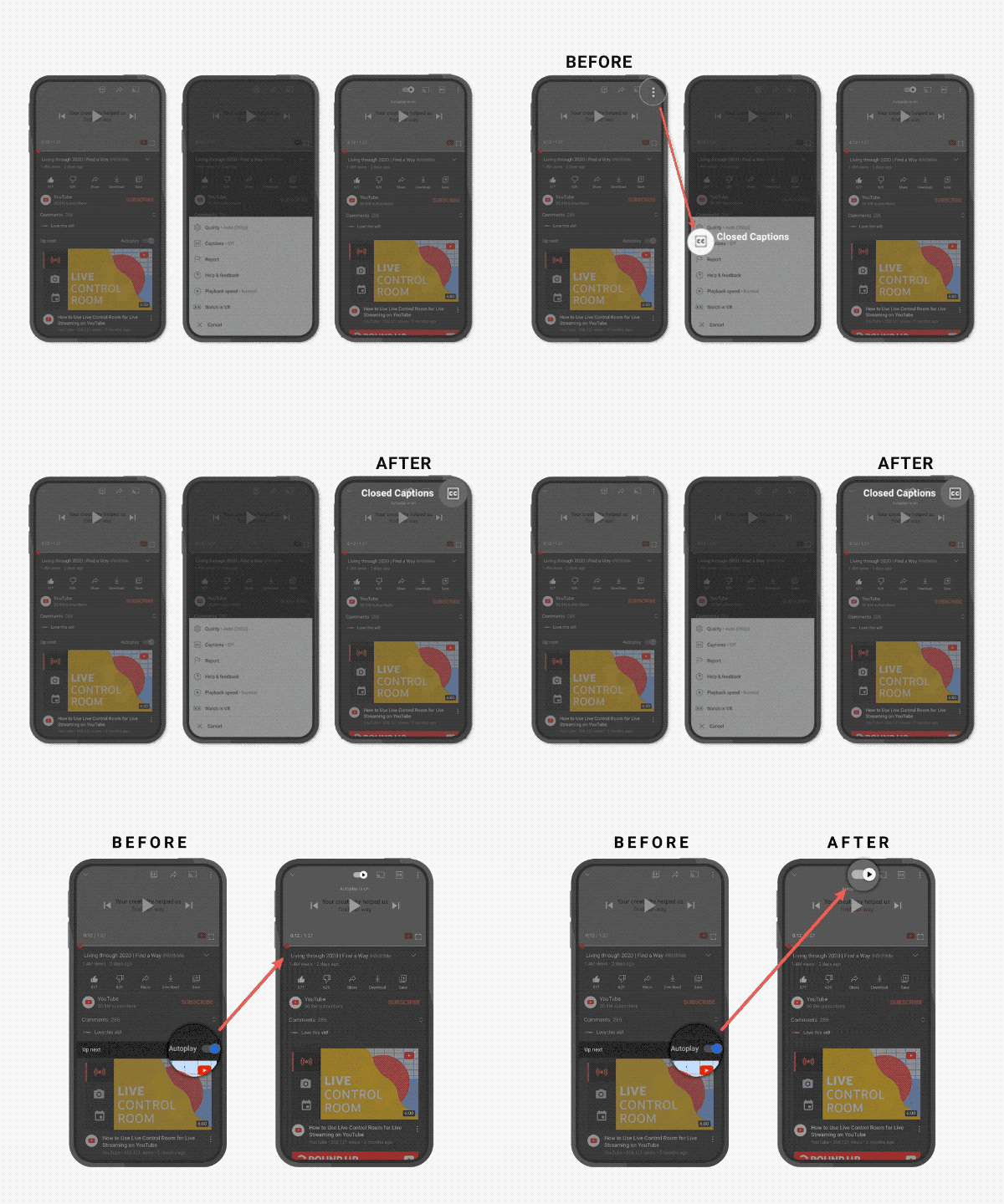
In terms of new additions to the actual player in the app, a closed-caption is now available on the overlay for all users to quickly turn captions on and off while a similar feature has been added for the autoplay setting. The chapter system has also been expanded so that users can pull up a list of chapters in a video and easily select where they’d like to jump to.
These are all very small quality of life additions to YouTube’s mobile app but they’re certainly appreciated. It seems like YouTube is deadset on bringing most of the app’s functionality specifically to the app’s actual playback window where most of a user’s attention is focused anyway. It might be that you need to be a bit more careful with your taps and clicks but it’s certainly an improvement on the general user experience.
(Source: The Verge)


