We're not sure what you're expecting from a R3,900 Android. We do know what we were hoping for, though - an operating system that is less of an irritation to use. If Vivo ditched the annoying skin, these phones would become much more attractive prospects.
-
Battery life
-
Design
We really, really want to like Vivo’s smartphones. They’re a relatively new company (at least in SA), they’re fighting in one of the most contested markets (in the world) and they really do know how to make a phone look good. The last time we checked in with a Vivo Android handset the results… weren’t all that great. Can the Vivo Y12, a budget-level handset costing R3,900 at retail, change our opinions of the smartphone newcomer?
Off to a good start
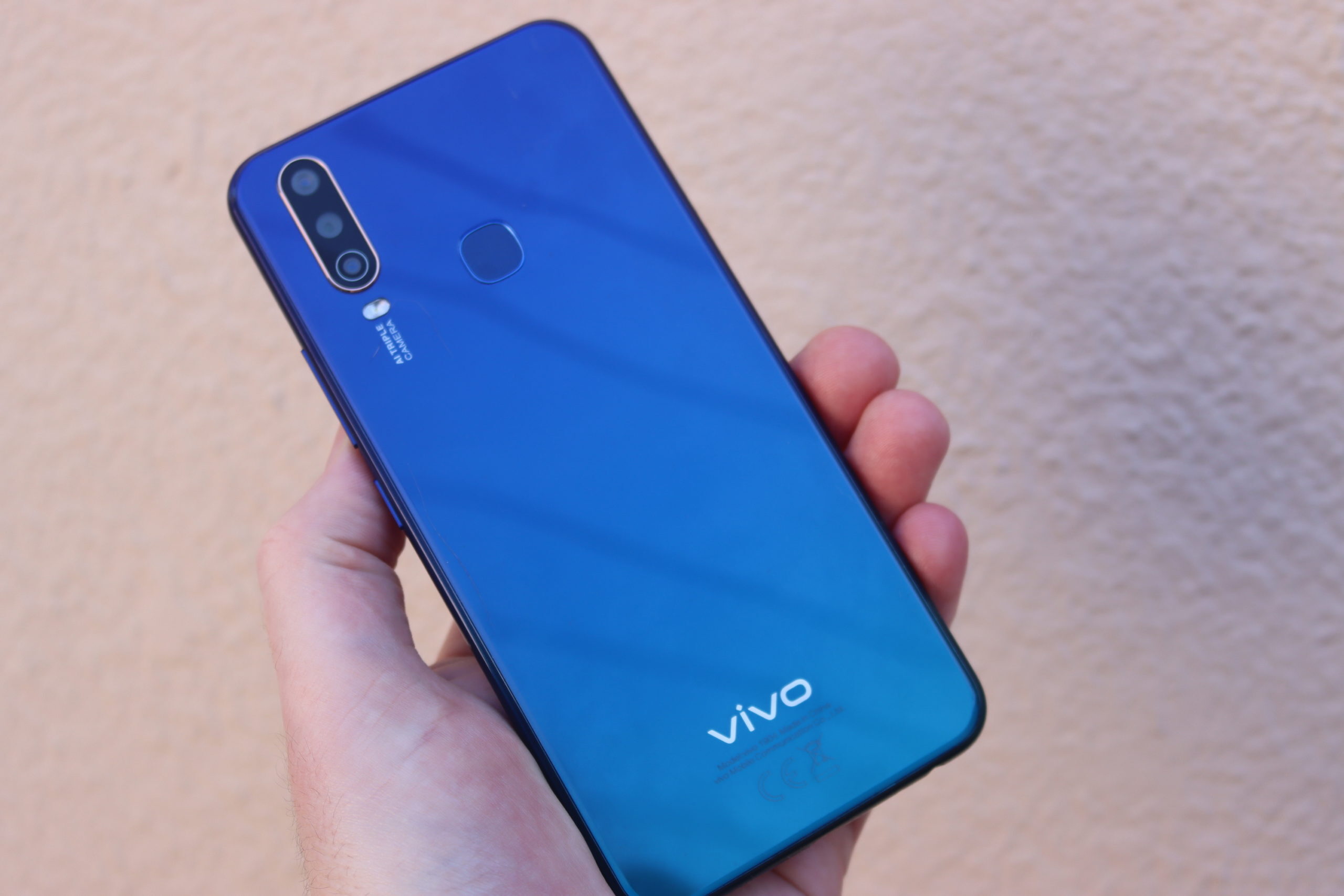
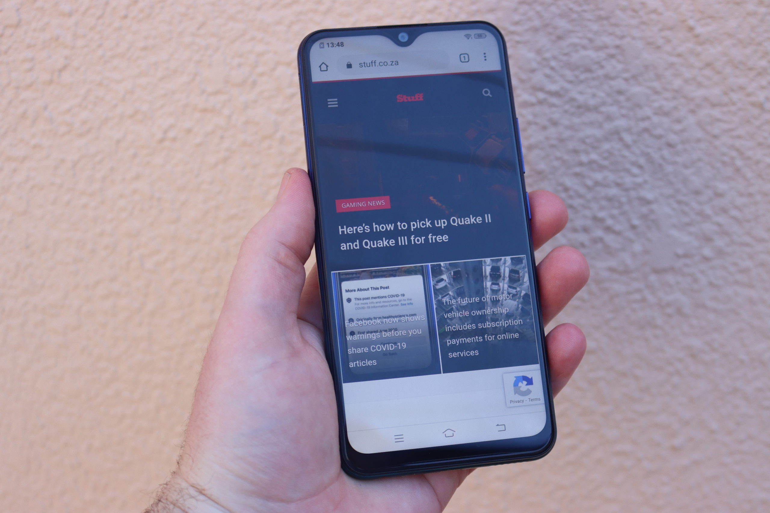 If the handset’s design is any indication, things are looking up for the brand. The few Vivo handsets we’ve seen in person have all had a little bit of Huawei design to them and it’s the same here. The Y12’s design, particularly from the rear, brings to mind pretty much any Huawei or Honor phone from the P20 onwards — smooth, shiny, clean, beveled edges and being a bit of a fingerprint magnet are the main themes here.
The triple (13MP, 8MP, 2MP) rear cameras are in the upper left corner, with a flash directly below. There’s a fingerprint reader in the upper middle, in the perfect spot for an index finger if you’re not the sort to implement facial recognition (which the phone also supports).
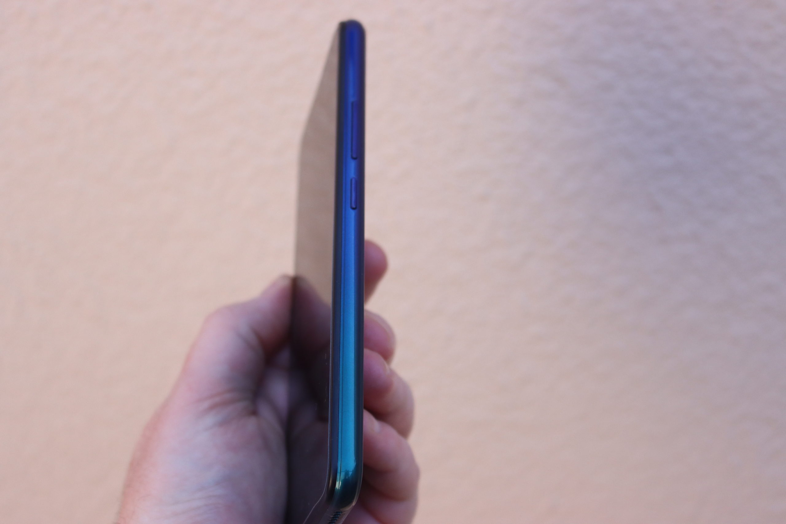
The 6.35in IPS LCD is a sub-HD panel (720 x 1,544) with a teardrop in the upper middle, which plays host to the 8MP front-facing cam. If you’re hiding the logo with your hand, it looks… well, like a moderately expensive Huawei handset. If, that is, you ignore that Vivo’s stuck with a microSD charge port. Oh, yeah, there’s also a headphone jack.
Gets the job done
 Inside the phone there’s a MediaTek processor — the Helio P22, which isn’t a bad octa-core based on the ARM A53. Along with 3GB of RAM and 64GB of storage (there’s a little under 50GB available for use), this constitutes a decent handset. At least, as far as the internals go. In practise, there are a few hitches and starts. This is particularly true when you’re first using the phone. The problem seems to chill out over time, unless you’re asking something unreasonable of the handset — like, say, Fortnite. Yeah, don’t do that.
That said, there’s a huge 5,000mAh battery in here. With the spec load being what it is, you’ve got a lot of uptime at your disposal. We’ve have liked the speedier charging USB-C provides with a battery this side but, well…
Look, it’s a budget smartphone. It’s not going to run as expensively smooth as an Android flagship for just R3,900. Its performance isn’t bad, at all, for the price you’re paying. Daily tasks should go off without a hitch (well, maybe just one or two) and you’ll even manage a little multitasking. Assuming you don’t lob this thing at the wall the way we wanted to… pretty much from the moment the phone booted up. Why? Well, FuntouchOS isn’t very fun.
The software sucks
 There’s a word we’d like to use to describe the FuntouchOS found in the Vivo Y12. We’re not allowed to say it, it comes before the work FuntouchOS and it also starts with the letter F. The OS combines the worst things about annoying salesmen and the sort of freemium mobile games that won’t take no for an answer and lays that over a perfectly functional version of Android. Vivo attempts to make their changes useful but they’re only useful in fixing the things Vivo broke in the first place.
You can’t access your file manager without a network connection. On-device (read: local) search only works from the drop-down if you give the phone permission to connect to the internet. There’s an AI system called Jovi which seems to be a more irritating version of the version of Bixby we’re currently ignoring and all of it wants unreasonable access to what we’re doing on the phone. The notifications tray (pulled down from the top) has had all the shortcuts excised and turned into a secondary menu that has to be swiped up from the bottom. Vivo’s got its’ own ‘we’ll watch your behaviour and recommend things’ page if you swipe left on the home screen but you’ve got to agree to all of the pointless information-gathering functions to get it working. At least it can be disabled for good.
The bits of the software that work? Whatever you installed yourself (provided your taste doesn’t suck), the stock Android stuff that Vivo hasn’t been meddling with and the Vodacom/Multichoice bloatware installed on the phone on first boot. At least those can be deleted — it’s a chore to make Vivo’s own software bugger off and die.
Candid camera
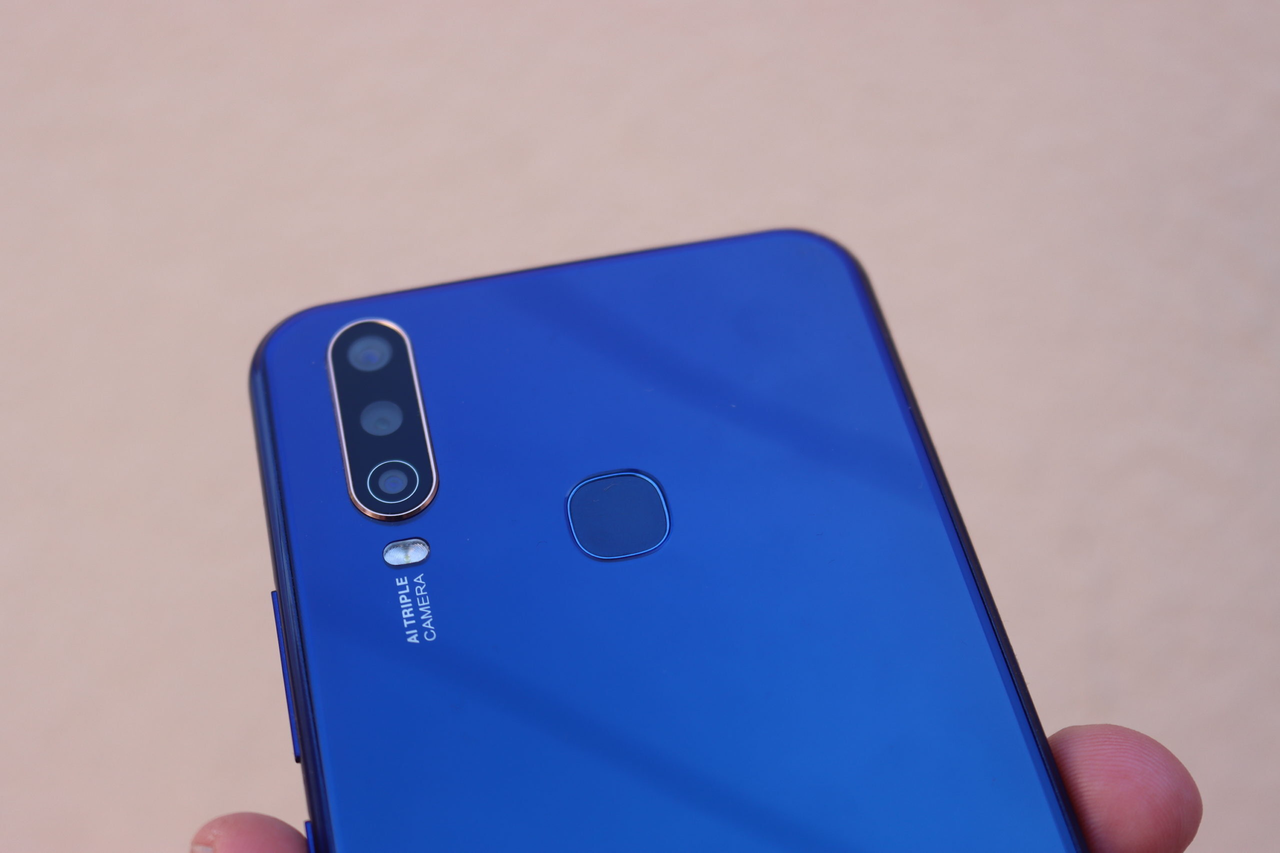 You might think that, after all that, that we’re about to say something nice about the Vivo Y12’s camera. You’d be incorrect, but at least we don’t outright hate it. The triple camera you’re getting is more of a selling point than something capable of taking really great images. They’re possible, don’t get us wrong, but it takes a little more effort.
There’s nothing approaching optical image stabilisation so if you need a properly detailed image you’re going to have to steady your arms somewhat. This sounds more like a Stuff problem than one someone who’s seriously considering this phone would have — we at Stuff have been spoiled by cameras that do their level best to make us look good. Here, you’ve actually got to develop some skill.
Even then, images degrade as you zoom in. They blur a little too soon for a triple camera arrangement but it’s good enough for social media. Unless, that is, you decide to avail yourself of the digital zoom. That way lies all sorts of aberration. Rather walk closer to your target (unless said target is a tiger, an American police office or some other predator).
Vivo Y12 Verdict
 As we said in the beginning, we’d really like to like the Vivo Y12. Any competition for the bigger brands is good for everyone at the end of the day. But we’re only really fond of the design and the spec here — it’s got a decent amount of power for a decent enough price. The camera is something that we can take or leave. It works enough that we don’t hate it. But the best thing we can say about the FuntouchOS is that it warns you about all the unreasonable access it’s asking for. We might have even forgiven that, if not for the fact that most of the ‘features’ are there to fix things that Vivo broke in the first place.
This isn’t a broken phone but it could so easily be a much better one. All Vivo has to do is create a version of its skin that doesn’t suck. And that’s easy enough to do — just stop screwing with stuff that already works.

