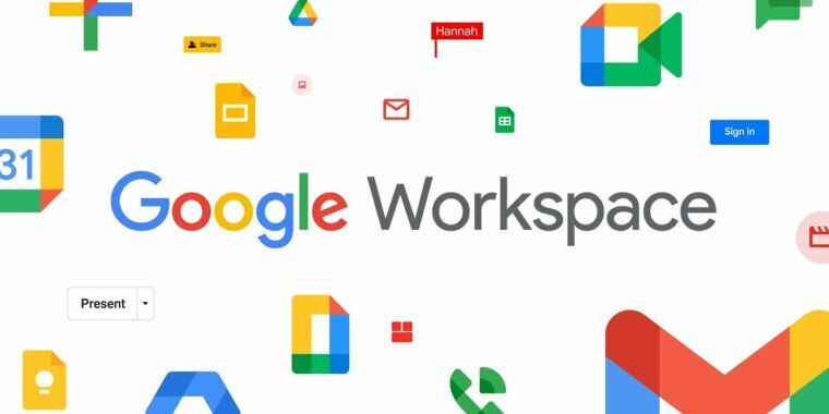
Just as you think you’ve gotten used to all of your app icons, Google goes ahead and unveils its new app icons for the whole Google Suite. Yesterday, Google announced that G-Suite, the company’s business app endeavour will be rebranded to Google Workspace, with a few new icons to accompany the new brand.
All of our favourites are getting new app icon designs. From Gmail to Calendar, Drive, Docs, and Meet will look slightly different come the next few weeks. All of the new icons will now boast all four of Google’s primary colours: red, green, blue and yellow. According to Google, the new icons will ‘represent Google Workspace’s commitment to building immersive communication and collaboration experiences’.
Not that we ever thought the icons weren’t cohesive? Right?
![]() But the new icon designs will follow Google’s ‘new design direction’ with its app suite. If you’ve seen the new Maps icon (how hard is it to find the app now?), and the Photos icon, you’ll have a good idea of what the new icons will look like come rollout.
But the new icon designs will follow Google’s ‘new design direction’ with its app suite. If you’ve seen the new Maps icon (how hard is it to find the app now?), and the Photos icon, you’ll have a good idea of what the new icons will look like come rollout.
We’re by no means saying that the Stuff team is adept at design or art or any visual skills. But the new icon designs seem very… adolescent. Google has gone out of its way to make the new app icons look like stickers that belong on your kindergartener’s backpack or pencil case. But who are we to judge, honestly.
So if you find yourself furiously swiping to find the Gmail app in a few weeks time, keep this in mind. Take a deep breath and look for the rainbow ‘M’.
Source: 9to5Google


