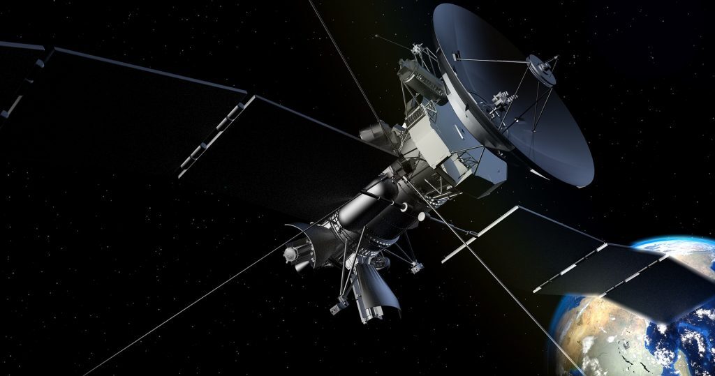
You have probably seen satellite images of the planet through applications like Google Earth. These provide a fascinating view of the surface of the planet from a unique vantage point and can be both beautiful to look at and useful aids for planning. But satellite observations can provide far more insights than that. In fact, they are essential for understanding how our planet is changing and responding to global heating and can do so much more than just “taking pictures”.
It really is rocket science and the kind of information we can now obtain from what are called Earth observation satellites is revolutionising our ability to carry out a comprehensive and timely health check on the planetary systems we rely on for our survival. We can measure changes in sea level down to a single millimetre, changes in how much water is stored in underground rocks, the temperature of the land and ocean and the spread of atmospheric pollutants and greenhouse gases, all from space.
Here I have selected five striking images that illustrate how Earth observation data is informing climate scientists about the changing characteristics of the planet we call home.
1. The sea level is rising – but where?
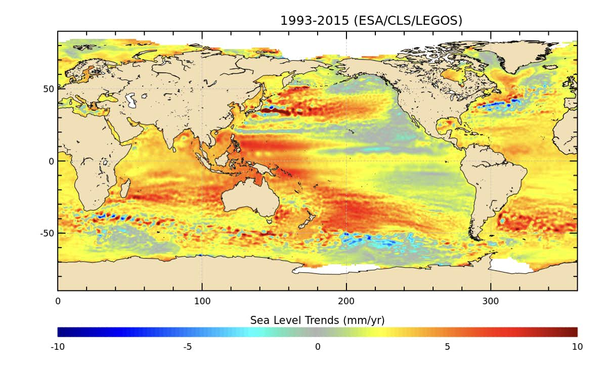
Sea level rise is predicted to be one of the most serious consequences of global heating: under the more extreme “business-as-usual” scenario, a two-metre rise would flood 600 million people by the end of this century. The pattern of sea surface height change, however, is not uniform across the oceans.
This image shows mean sea level trends over 13 years in which the global average rise was about 3.2mm a year. But the rate was three or four times faster in some places, like the south western Pacific to the east of Indonesia and New Zealand, where there are numerous small islands and atolls that are already very vulnerable to sea level rise. Meanwhile in other parts of the ocean the sea level has barely changed, such as in the Pacific to the west of North America.
2. Permafrost is thawing
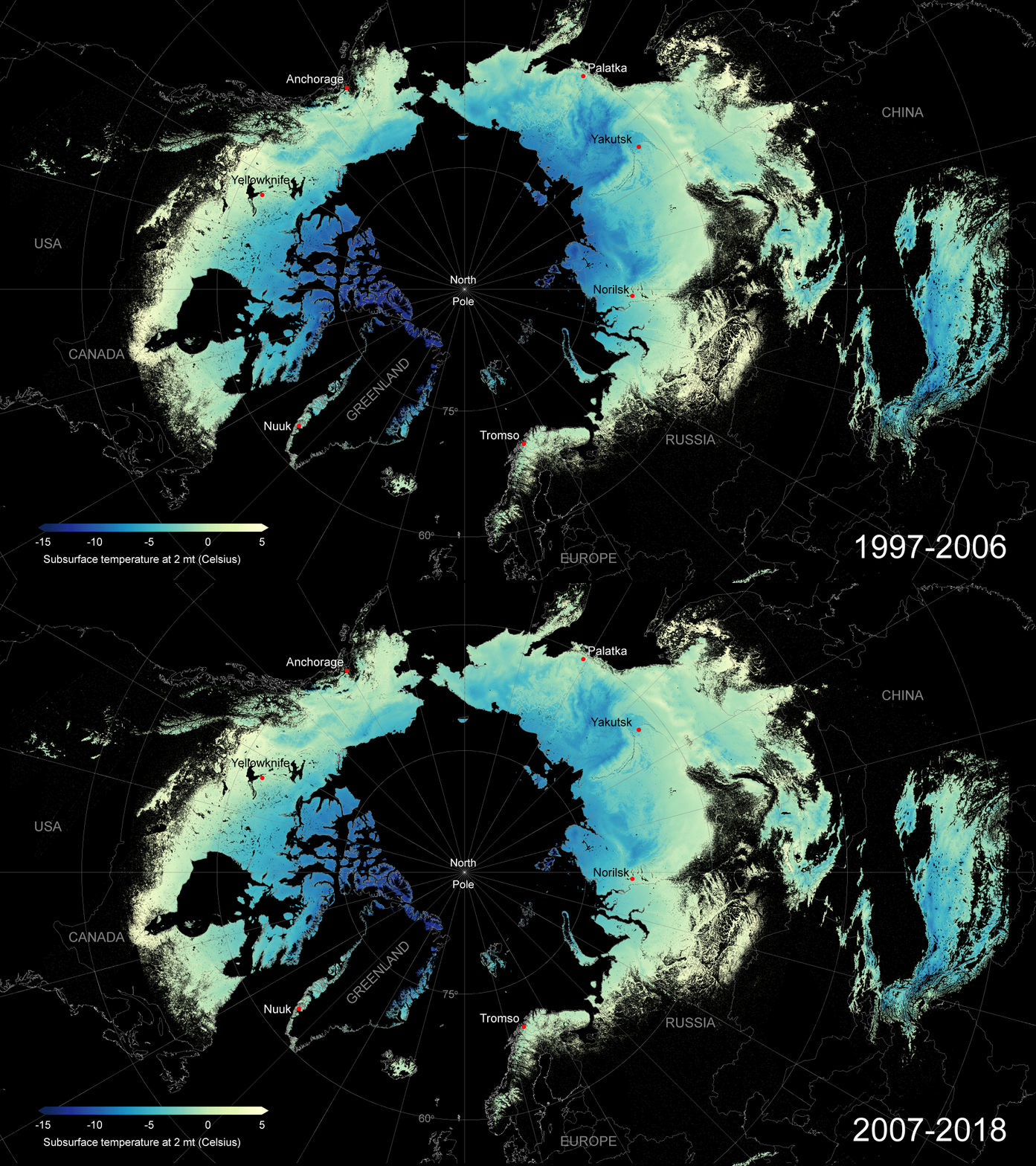
Permafrost is permanently frozen ground and the vast majority of it lies in the Arctic. It stores huge quantities of carbon but when it thaws, that carbon is released as CO₂ and an even more potent greenhouse gas: methane. Permafrost stores about 1,500 billion tonnes of carbon – twice as much as in the whole of the atmosphere – and it is incredibly important that carbon stays in the ground.
This animation combines satellite, ground-based measurements of soil temperature and computer modelling to map the permafrost temperature at depth across the Arctic and how it is changing with time, giving an indication of where it is thawing.
3. Lockdown cleans Europe’s skies
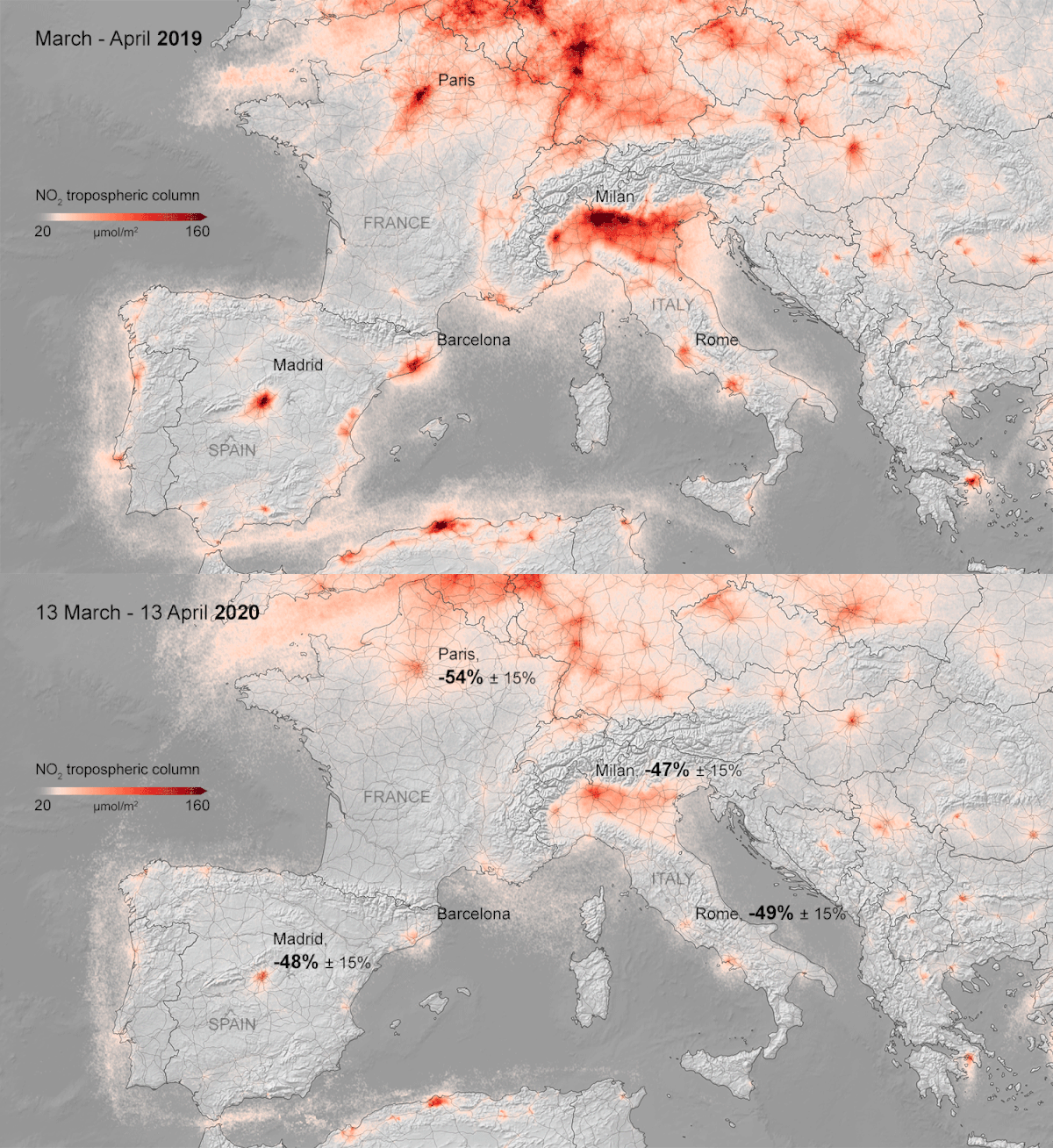
Nitrogen dioxide is an atmospheric pollutant that can have serious health impacts, especially for those who are asthmatic or have weakened lung function, and it can increase the acidity of rainfall with damaging effects on sensitive ecosystems and plant health. A major source is from internal combustion engines found in cars and other vehicles.
This animation shows the difference in NO₂ concentrations over Europe before national pandemic-related lockdowns began in March 2020 and just after. The latter shows a dramatic reduction in concentration over major conurbations such as Madrid, Milan and Paris.
4. Deforestation in the Amazon
Credits: ESA/USGS/Deimos Imaging
Tropical forests have been described as the lungs of the planet, breathing in CO₂ and storing it in woody biomass while exhaling oxygen. Deforestation in Amazonia has been in the news recently because of deregulation and increased forest clearing in Brazil but it had been taking place, perhaps not so rapidly, for decades. This animation shows dramatic loss of rainforest in the western Brazilian state of Rondonia between 1986 and 2010, as observed by satellites.
5. A megacity-sized iceberg
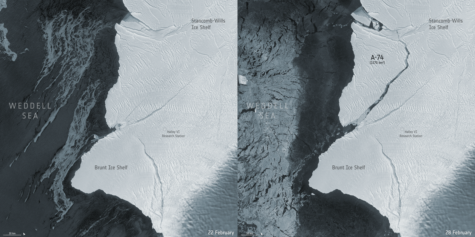
The Antarctic Ice Sheet contains enough frozen water to raise global sea level by 58 metres if it all ended up in the ocean. The floating ice shelves that fringe the continent act as a buffer and barrier between the warm ocean and inland ice but they are vulnerable to both oceanic and atmospheric warming.
This animation shows the break-off of a huge iceberg dubbed A-74, captured by satellite radar images that have the advantage they can “see” through clouds and operate day or night and are thus unaffected by the 24 hours of darkness that occurs during the Antarctic winter. The iceberg that forms is 1,270 km² in area which is about the same size as Greater London.
These examples illustrate just a few ways in which satellite data are providing unique, global observations of key components of the climate system and biosphere that are essential for our understanding of how the planet is changing. We can use this data to monitor those changes and improve models used to predict future change. In the run up to the vitally important UN climate conference, COP26 in Glasgow this November, colleagues and I have produced a briefing paper to highlight the role Earth observation satellites will play in safeguarding the climate and other systems that we rely on to make this beautiful, fragile planet habitable.
- is Professor of Physical Geography, University of Bristol
- This article first appeared on The Conversation

