
Sometimes it pays to be a subscriber. Specifically, a Twitter Blue subscriber. Android users may now change the layout of the navigation bar in the Twitter Blue app. If the new centre-located Spaces icon annoys (it does), subscribers may now banish it from sight. And also rearrange the general look and feel how they see fit. The feature was previously confined to Blue users on iOS.
Spaces in certain places
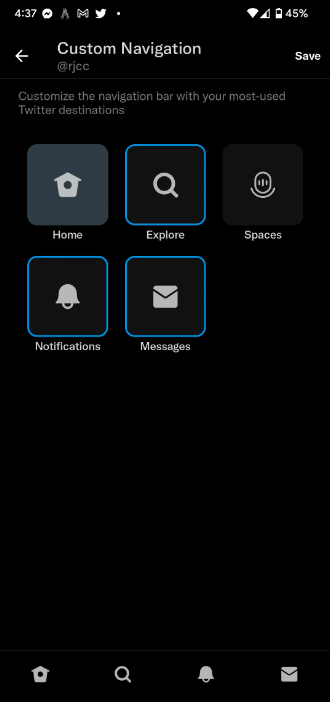
The service’s new custom navigation function lets users determine the number of tabs. This is perfect for decluttering the navigation bar or setting up exactly the tabs you need, in the order you need them. Custom navigation lets users display as few as two tabs at a time or maintain all five that are displayed by default.
Spaces is perhaps the first to go, though. The Spaces tab was first tested on iOS last year and appeared on Android in May. Its central placement seems almost designed to irritate users into signing up for the $3/m (R50/m) Blue plan introduced last year. Well, it does fix the problem.
Not out of the woods yet
Twitter Blue can’t shield users from all the new features clogging up the app, though. Last week, Twitter said it would be adding more information to the banner that displays active Spaces at the top of your timeline. The company seems really invested in getting its users to use voice chat.
The new section will soon display information about a given Space’s host, everyone who tweets in the Space, and important Topics. If you’re unhappy about that, you’ll have to learn to live with it. There is currently no option to completely disable this banner. Not even Blue subscribers can escape it — at least, for the moment.
Source: The Verge

