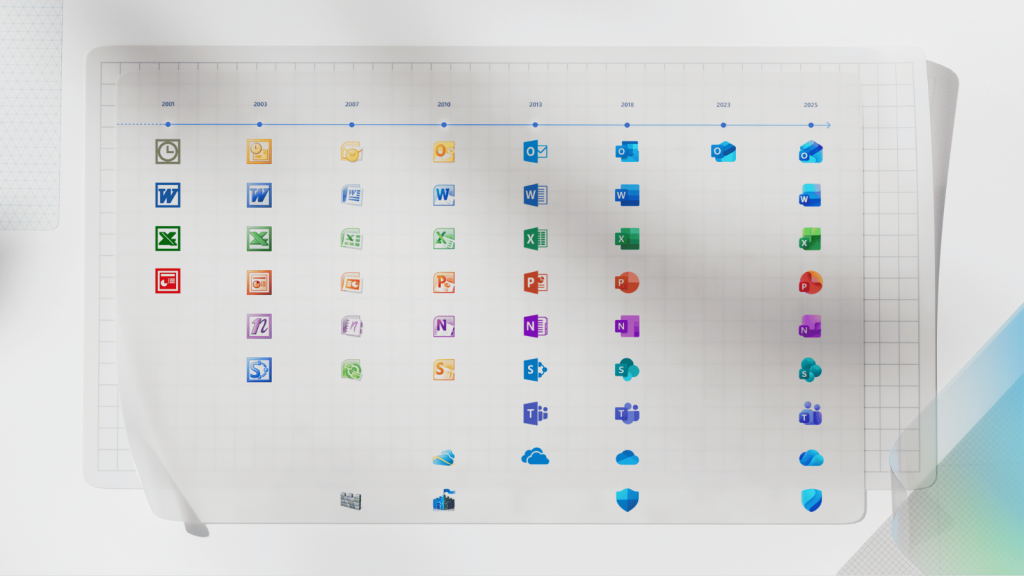
If you’re reading this, there’s a good chance you are your family’s tech support. If you bear the weight of that roll, we salute you. We also thought we should give you and people like you a heads up that Microsoft has finally unveiled new icons for its Office apps for the first time since 2018.
They might look slightly familiar if you were paying attention when they leaked earlier this year, but now they’re official, heading to a PC near you, and will probably cause at least a little confusion for folks not permanently plugged into the internet.
New Office icon, who dis?
Microsoft’s new icons for its Office apps, which aren’t actually called ‘Office apps’ anymore, feature a modern design with a focus on colour gradients, similar to Google’s new ‘G’ logo. This is the first time the popular workplace programs have had a new look since 2018’s redesign.
“The core 10 Office apps were last updated in 2018 and the way we described what the designs represented is almost identical to language used today: connection, coherence, seamless collaboration, fluid transitions,” explains Jon Friedman, corporate vice president of design and research for Microsoft 365.

If you squint a little and get right up to your screen, you might even notice that the new icons are a little simpler. Word’s icon, for example, now uses three horizontal bars instead of the outdated four bars in the previous design. This change apparently improves legibility for smaller sizes of the icon.
“We’ve moved away from bold, static solidity to embrace softer, more fluid forms,” Friedman explains. “Sharp edges and crisp lines are replaced by smooth folds and curves, giving the icons a sense of playful motion and approachability.”
Do you get a sense of the ‘playful motion and approachability’ when you look at the new icons? You do? Oh, well, good for you, we guess.
You can expect to see the new Microsoft 365 icons across desktop, mobile, and web apps in the coming weeks. Maybe give your technically-challenged loved ones a heads up.


