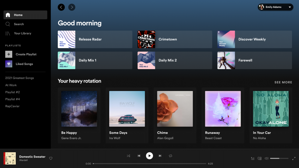
While we’ll openly admit that we prefer Spotify’s mobile app to its older desktop counterpart, it’s not something we’d discard entirely. When you’re hard at work on your computer and wish to drown out the sounds of a frustrating world, it’s much easier to just open the desktop version of Spotify than fumble around with your phone. It’s a good thing then that the desktop app is receiving a much needed makeover. Spotify announced last night that it was beginning to roll out an update that will improve the design of the desktop app which, if you ask us, should have happened ages ago.
“Since the desktop experience served as the original window to the world for Spotify, this was not a task Spotify took lightly. It began with months of tests and research, talking to users, and gathering feedback. Spotify is excited to deliver a new, clean design, more controls, and a great new foundation for our listeners to use Spotify across our desktop app and web player for the years to come,” reads the press release sent out by Spotify today. Considering the music streaming app’s massive global expansion, it makes sense to improve wherever possible.
Spotify under the spotlight
So what exactly can we expect to change with the app’s design? For starters the “Search” feature has been moved to the left side of the navigation page. User’s profiles will now also display their top tracks and artists, and a radio session can be started for any song by simply clicking the “…” next to whichever track you want to kick off with.
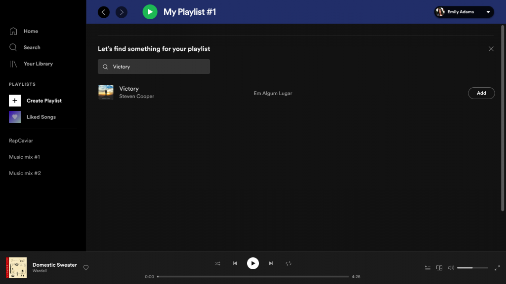
Playlist creation has also be overhauled to be more robust and accessible. You’ll now be able to write descriptions, upload custom images, use a “drag and drop” feature to add songs to a list, and use an embedded search bar to speed up the process of growing your playlist with whatever you see fit.
Perhaps best of all is that Premium users will now also be able to download tracks onto their PCs, excellent for those bouts of loadshedding that come out of nowhere.
It’s a long overdue update for an app that, while functional, really didn’t compare to the efficiency of the mobile version. The changes began rolling out yesterday and will slowly make their way to all users over the next month. You can read the full list of updates and tweaks here.


