Why is it that every brand feels the need to rebrand itself? And why does it never look good? Fortunately, First National Banks’ new logo isn’t the focus of this article. If it was… there wouldn’t be much to write about. It’s minimalist. That’s about it. Joining FNB’s new logo is a redesigned app and website – filled with a plethora of new features.
During FNB’s launch event on Friday morning, it mentioned that it would be shifting its focus into becoming more “advice-led”, moving away from its previous “product-led” mindset.
New app, new website, uglier logo, same FNB?

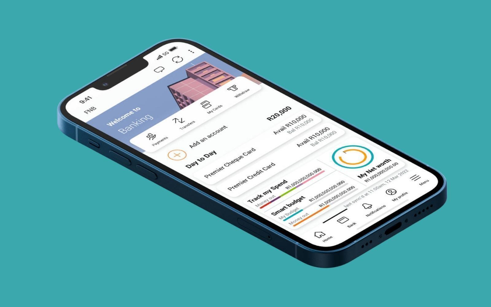
FNB’s new app has been redesigned to offer a more intuitive and personalised experience, and to offer “a safer digital experience”.
Customers are given the ability to customise their home pages, based on the features most important to them. Users will be able to quickly see a “snapshot of their transactional accounts, credit, investments, insurance, and value-added services”.
Additionally, the app has received better search functionality. The bank continued to say that similar changes to that of the app are being made to the bank’s website.
Money Protect – finally, something new – is FNB’s “free” insurance cover for “certain fraud-related losses when using interfaces such as the FNB App and ATMs. FNB points to Money Protect as a way it’s helping customers make the switch to the digital age.
Read More: FNB extends its petrol and SLOW Lounge eBucks promotions – adds a few more
New ways to pay
If you’re searching for FNB Pay, it’s now the payments umbrella in the redesigned app. With it comes new and improved ways to pay, such as;
- Instant Payments – perhaps the coolest feature of the entire launch. It gives users a way to pay others, requiring only their bank card number. Better yet, money transferred will be instant (hence the name), no matter where they bank.
- ChatPay – customers can pay or request payment from any other FNB user using the chat functionality built into the app.
- PayMe – if you hated the era of ‘poking’ on Facebook, then you’ll hate PayMe. This allows users to politely request payment digitally to any FNB-banked cell number. Just follow the on-screen prompts, and the payer will be sent a notification asking them to pay. Or else.
- Virtual Cards – FNB Virtual Cards can now be used to pay for travel bookings; buying flights and accommodation. These cards can also be added to wallets such as Google Wallet and Apple Pay to make it easier to make payments when overseas.
- Bill Payments – a faster way for customers to use the FNB App and pay their EasyPay or Pay bills.
Lastly, we arrive at FNB’s newly designed logo. Yes, that’s all…they’ve got a new logo.


