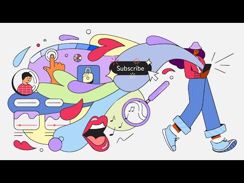
If you’ve been awaiting a massive glow-up from YouTube, you’re finally getting your wish. Earlier today, YouTube announced that it’ll be rolling out around thirty new features and design changes that’ll make content “easier to use, more fun, and more engaging,” across mobile, web, and TV.
We’re going to give it to you straight. Don’t expect many of the updates to actually fix any of the important stuff like its recommendation algorithm, search results, or spam bots that still plague the comments section to this day. Instead, YouTube’s gone down the easy route, adding some features that aren’t exactly game-changers, but should still make for a less jarring experience overall.
Better than nothing we guess?
We’re going to go ahead and get the cooler of the thirty changes out of the way, so there’s no disappointment later. The biggest addition (seriously) is the merging of the ‘Library’ and ‘Account’ pages into a new home: the ‘You’ tab. It’ll keep all your downloaded, saved, and previously watched content in one place with your account details, because switching between the two was such a hassle.
YouTube’s suite of mobile and tablet devices is getting the lion’s share of updates, the most useful of which involves a screen lock to avoid skipping or switching to another video entirely. Next up is “Press to 2x” which is exactly what it sounds like. Rather than scramble in the settings to speed things up, just hold down on the right side of the screen and you’re off.
Read More: YouTube’s got some more AI-powered creator tools on the way
Another change – again, only for mobile – is “stable volume” that’ll rid your ears of any drastic increases when in the middle of a Steven Crowder video or whatever it is Google has decided to recommend. There’s no need to stress about finding the setting either – it’ll automatically be turned on when the update goes live on whatever platform you use.
Bigger preview thumbnails are a thing now too, with a haptic feedback component thrown that’ll vibrate when you hover over the spot you started scrolling at. It’s… a change, sure, but isn’t worth all the fanfare YouTube is throwing at it. That is a common theme here.
Finally, we’ve got some improvements to Search, just not the changes we were looking for. Singing, humming, or just playing a song into YouTube’s search bar is a thing now, with YouTube’s AI doing most of the work to match the provided sample to the original recording. There’s some waiting before YouTube makes the feature live, and it’ll only be available across Android at first.
TV hasn’t been left out
The rest of the updates pertain to the abstract, most of which are exclusive to its Smart TV app, though some will roll out across the rest of the suite eventually. One such feature includes on-screen cues and animations that’ll release a burst of confetti (and dopamine) when you hit the subscribe button right after being told to.
The many other changes (YouTube did say there were 30 total) aren’t nearly as interesting, and mostly just give the UI a cleaner look, with some bigger thumbnails, new channel home pages (on TV), and a vertical menu that’ll keep comments, descriptions and that subscribe button holed-up together. The video above details it all if you’re really interested.
Don’t expect all these changes to hit at once, either. The various additions and changes will be rolling out gradually over the coming weeks, before eventually making their way into the rest of YouTube, such as YouTube Kids. Whether these new features will justify the service putting the brakes on ad-blockers on the platform remains to be seen.

