The Y9 Plus feels like it was designed to be a "spare" phone. The one you take with you on a camping trip to ensure your nicer device isn't harmed. Which sounds more scathing than it is, but I guess the opportunity to have a device such as that is appealing in it's own right. Just don't be disappointed when your realise the true restrictions around the device. Cheap-feeling build quality, an incredibly underwhelming camera and flimsy screen detract from an otherwise fine phone.
-
Usability
-
Aesthetics
One of the most difficult aspects of reviewing hardware is separating the device from the cost. It’s something I’ve battled with in previous reviews yet an issue that I’ve struggled with more than anything else during my time with the Doogee Y9 Plus. This is a handset that’s very clearly going for the lowest end of the market it can possibly appeal to while still doing it’s best to offer a high quality user experience. I respect that, more people should be able to have some aspect of their life improved in a world being ever consumed by the internet, yet it can be expensive to do so. The Doogee Y9 Plus certainly seems on the outside like an impressive device, yet visuals can be deceiving.
Teach me how to Doogee
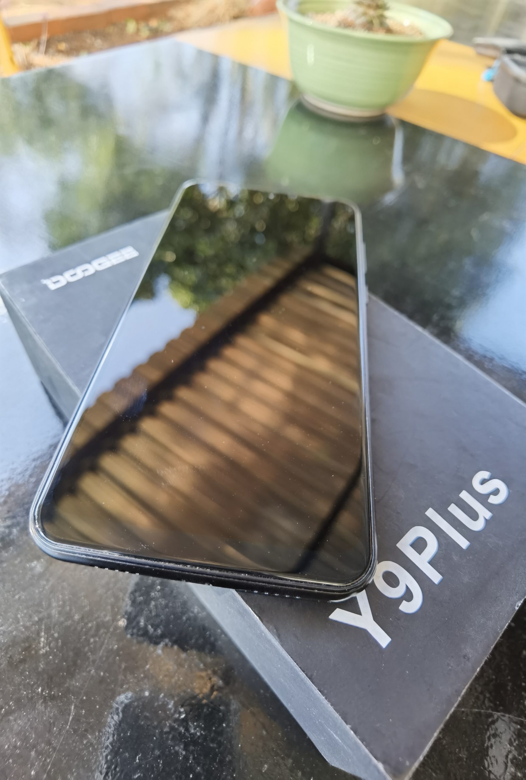
First impressions when you unbox the device are pretty solid. The Y9 Plus is a great looking phone, smooth and polished in all the right places. It’s something of an aesthetic throwback to an older generation of smartphone, one that wasn’t all about bulk. Which isn’t to say the phone is small, if anything I found it to be the perfect size. Fitting comfortably into my hand or pocket, it’s not cumbersome which is helped along by it’s wonderfully light weight build. Yet it very quickly becomes apparent why the Y9 Plus is so light: It feels cheap. Despite featuring parts of an aluminium alloy build, the body feels like it’s made made more of plastic and the screen, while still retaining the clarity you’d expect from a 6.3″ FHD IPS display, feels remarkably easy to scratch. Sure, that cheaper build quality might make the damage caused by the occasional drop a little less visually damning at the risk of the phone just…breaking.

Electric Doogee-loo
Yet beyond that fairly cheap exterior, there’s a decent performance to be had with the Y9 Plus. The IPS display renders everything with a vividly gorgeous colour clarity when you’re looking at other people’s pictures and not your own captured photos. One of the weakest aspects of the Y9 Plus is the camera which feels substantially outdated not just compared to other flagship models but budget variants in the same price bracket. I mean, while there are three cameras on the back, they only come in at 16MP, 8MP and 8MP with Dual-LED and Auto-focus functionality. The result is a picture quality that feels painfully and noticeably outdated which isn’t even taking into account the 16MP front facing camera which takes selfies that resemble the profile picture of that weird 47 year old dude on Facebook who occasionally makes a rude statement about woman on his public status.
Speaking of outdated, that goes for the phone’s operating system which is still running Android Pie 9.0. Look, it’s not a bad operating system but after Android 10 was releasing just under a year ago, it seems strange to be selling an Android device with outdated software. It’s not terrible but there is a noticeable jank and minor delay to swiping around the phone’s menus but never enough to make me feel like I should take a more cautious approach to how active tabs I have at any given moment.
If anything, the the Helios P23 processor and the installed 4GB of RAM deliver a surprisingly smooth experience even when placed under considerable strain. I was expecting to run games like PUBG Mobile and yet the Doogee Y9 Plus delivered gameplay that was smooth and untouched. A surprise, but a pleasant one.
Who Let the Doogee Out?
I think the question I’ve been trying to answer in this review is, “Who is Doogee targeting with the Y9 Plus?”. Sure, it’s very easy to say it’s a device made for folks on a strict budget, yet there are plenty of phones that fit into that category. The Y9 Plus isn’t offering a cheaper alternative with an amazing camera but worse operating system, it’s doing the reverse. The actual phone, the software and apps running on the device, work just fine. Pretty good, if anything. It’s the peripherals and exterior factors that make me dislike the Y9 Plus. The camera is, as said above, absolutely shocking even for a phone as cheap as this and the build quality really doesn’t instill a lot of trust in the phone.
Yet I think those are problems that people will happily overlook for a phone that just works and works well at that price. A person buying the Y9 Plus has to know what they’re getting out of the deal, which is basic, tuned functionality at the cost of all the nice little extras we’re so used to. This is a phone built on raw necessities, not luxuries. A device for a person who just needs to make phone calls, send messages and maybe Google the occasional fact (yes, Google is available on the Y9 Plus).
Conclusion
The Y9 Plus feels like it was designed to be a “spare” phone. The one you take with you on a camping trip to ensure your nicer device isn’t harmed. Which sounds more scathing than it is, but I guess the opportunity to have a device such as that is appealing in it’s own right. Just don’t be disappointed when your realise the true restrictions around the device. Cheap-feeling build quality, an incredibly underwhelming camera and flimsy screen detract from an otherwise fine phone.