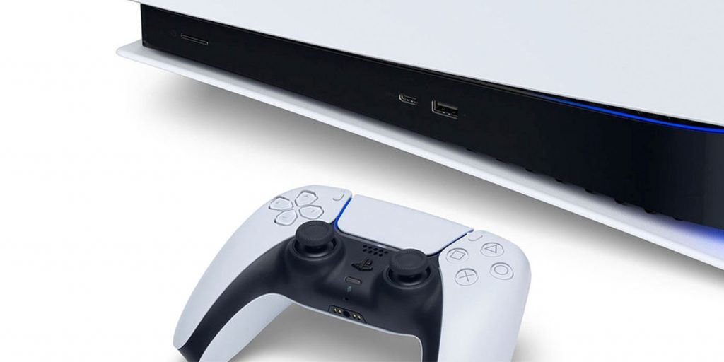
We’re just over a month away from the launch of the PS5 and while Sony has been more forthright with information regarding its new console (better late than never) one of the things people have been desperate to know more about is how the user interface is going to function. A decent UI is harder to find than you think.
The key to a really well designed UI is that you shouldn’t notice it. When menus are difficult and tedious to navigate then it’s not great for any app or software because you’re stuck using it for extended periods. Having said that, the UI for the PS5 looks clean, neat and well built to forward community interaction — all while looking a touch generic for our tastes.
Sony released a fairly lengthy break down of what consumers should expect from the PS5’s UI, one that not only highlights how the system looks but how social and community functions are integrated into the platform. It looks like a complete overhaul from the PS4’s UI, which was very trim and (arguably) too basic in its functionality. The opposite could be said for the PS5, which looks robust and capable of fielding gaming needs and social interactions.
Stuck in the Middle with UI
The biggest change for Sony’s system comes in the form of “cards” which will highlight games currently installed on the system, available for download or a selection of streaming apps that are accessible in a separate tab.
Hovering over a game will provide information on the title and with a swipe, you’ll see a host of news pieces, hints, videos and general updates from the developer. A similar setup is used on the PS4 but the presentation here feels more honed in and specific rather than jumble that was on the PS4.
The Control Centre is a separate menu accessed by pressing the central PlayStation button on the DualSense controller. This Control Centre will allow users to customise aspects of their console, including organising friends lists, notification settings and download monitoring.
Activities is also a new feature that takes on the form of menu cards on the PS5. These Activities link to whatever game you’re playing and offer a more specific look at features within the title. Selecting these cards lets players load up specific levels, monitor progress on goals, get an overview of the level you’re currently playing and a personalised estimate of how long it will take you to finish up the level.

In terms of social interactions, the PS5 lets players stream their game to anyone in the same party as them. While it might seem like a needless feature, those who’ve spent many hours watching friends play games through a similar system on Discord will see it’s a really cool way of bonding with a friend. Being able to play a single-player game together but not actually together is something we’ve all come to need in the Year of the Lockdown.
Coolest of all is the addition of Game Help, a card that players select when they’re stuck on something in a game. This card, which can be set as a picture-in-picture display, offers helpful hints and tricks to players. It’s a really cool feature that should hopefully save players the time of switching to a different device to Google the solution to a particularly frustrating puzzle. Unfortunately, this feature is only available to PlayStation Plus subscribers.
While the general design of the cards and icons feels very… derivative of programs like Steam and Good Old Games, that have been known to use similar layouts, the quality of life improvements they bring to the console are really neat. We can’t wait to try out the PlayStation 5 when it eventually launches on 19 November for R12,000 and R10,000 for the Digital Edition.