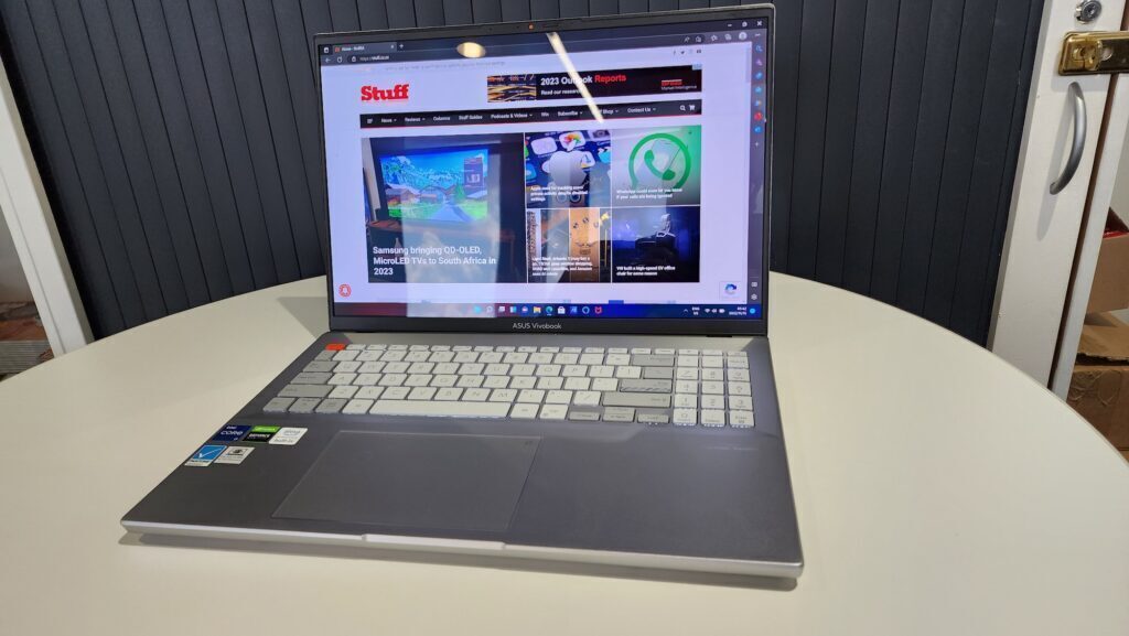
If you didn't pick up the 11th-gen version of this computer (which has the exact same name), then this one is worth considering. Provided you haven't purchased any other OLED-packing Asus computer in the last year or two. You'll probably find there's a feature or two here that you don't really need. But you know what they say - rather have it and not need it than need it and not have it. Right?
-
Design
-
Display
-
Performance
-
Price
-
Features
Asus has dropped its new Vivobook Pro 16x OLED onto a very crowded notebook market. It’s an excellent piece of hardware but it’s sadly marred by the fact that it’s the second time we’ve seen it this year. The previous model, which shares the exact same name, is a little slower and lacks a few features. But, by and large, it’s the same machine.
The chassis design is almost completely identical. The lid is absolutely the same between both machines. Most of the differences require a closer look — the port arrangements are totally different, for example. But you don’t buy a notebook for the port arrangements. Do you?
Solid as ever

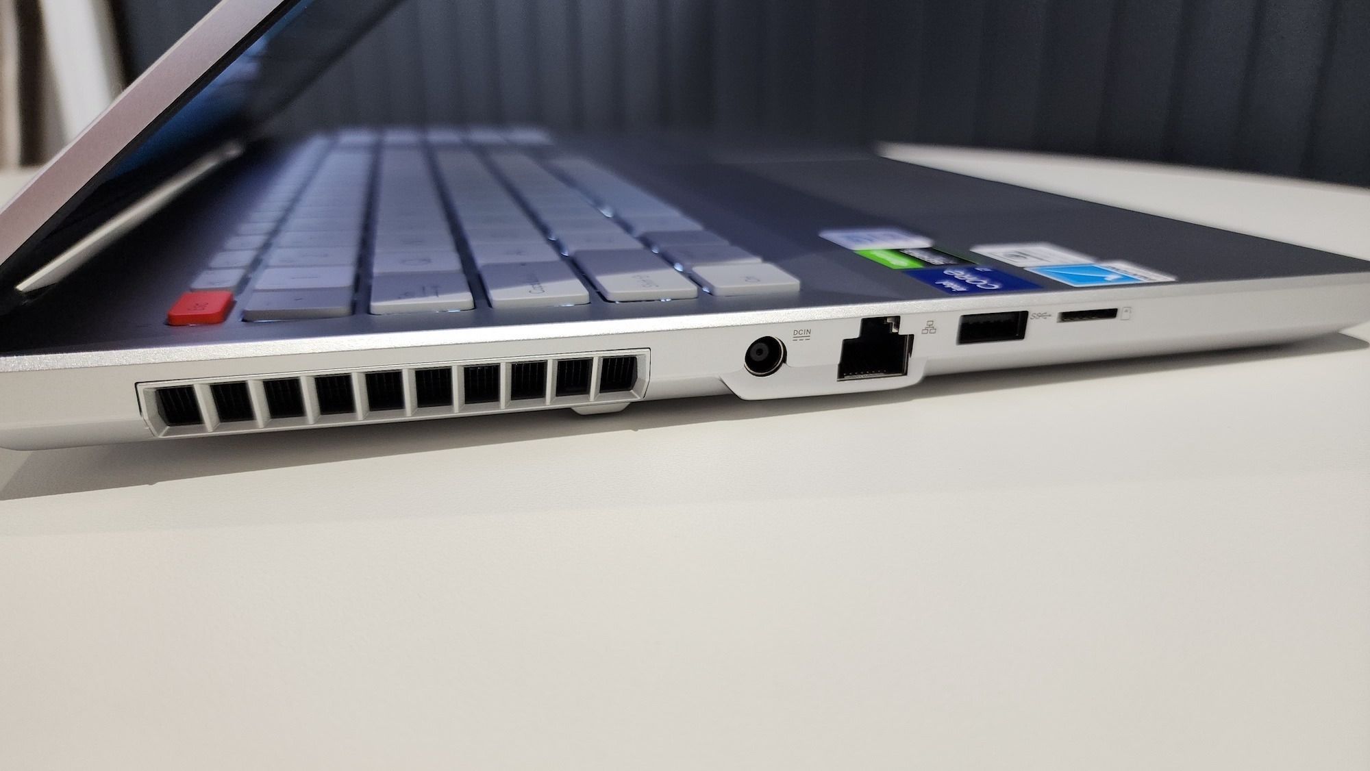
There are some differences when it comes to design. There are serious vents along three of its edges. Visible just below the large spaces are the cooling vanes Asus has packed into the Pro 16x to prevent it from melting when in use. It’s an attractive, aggressive, and symmetrical design that directly contributes to one of the notebook’s worst features — the placement of the power port.
Along the left side, you’ll find the power port, as well as a full-sized ethernet, a USB-A, and a microSD slot. Trouble is, the power port is about midway down the edge. We get it — the cooling vents take priority. But that placement puts the notebook off balance. It feels as though the cable is trying to drag your machine one way or another.
Along the right side are two USB-C ports, a full HDMI, another USB-A, and a 3.5mm audio jack. With no power cable on that side, there’s little to complain about there.
OLED off the path
We’re also a little less than impressed with the Vivobook Pro 16x’s lid. It sports a lovely rear panel, made from the same metal as the rest of the body. It’s amazingly thin to boot, but that’s part of the problem. There’s a little too much flex to the lid to make us feel really comfortable. Prodding at the back doesn’t give the screen in front of it any grief, though we’re sure you could deform the panel with enough pressure. We just didn’t use it, because we’re supposed to test these things. Not break them.
We’re probably being a little too harsh here. The base of the machine is immensely sturdy. By comparison, the lid comes across as flimsy — even though it’s not really. Still… for R35,000, we’d expect a little more consistency when it comes to the build.
Turn it up a notch
But if you already own the Core i7-11370H/RTX 3050 Ti/16GB RAM/512GB NVMe SSD model… you really don’t have to upgrade. The numbers are a little higher but so is the price. The older version launched at R25,000. This one’s quite a bit more expensive. The increased storage accounts for a bit of it, but there’s also an additional feature or two that is wholly new.
Asus likes to build number pads into its trackpads so it can supply roomier keyboards on smaller laptops. This one happens to have a nearly fully-sized interface, so Asus has done something a bit unusual. You might remember the company’s ProArt laptop. It features a physical dial used for controlling various functions in Photoshop and other supported programs. Well, instead of a strange custom addon, Asus has reproduced it as a touch control on the trackpad.
Its function is identical — that is, unless you’re using the right software. But it’s a unique feature that doesn’t require you to contend with an unusual controller. Whether you prefer the tactile sense of an actual dial or just want the functionality will depend on you. It works the same way at the end of the day.
Asus Vivobook Pro 16x OLED verdict
The Vivobook Pro 16x OLED (this one, at least) is particularly confused. It’s not really for gaming, though that’s possible. It’s not really for design, but that’s also possible. It’s best suited to the office, but it’s got features that you really don’t need. It lacks consistency. The lineup will probably replace it with something that doesn’t work quite the same way but will retain the name. Still, if you’ve got R35k and want a solid, capable machine, this is one of those.
