Some of us just enjoy living on the dark side, and we prefer our Google searches that way too. Today Google updated its dark theme with an even darker dark theme on the Google app on Android.
Last week some users over the globe got to experience a darker desktop web search as well, capable of changing from Dark Grey to Your-Ex’s-Heart Black. It similarly tweaked other colours for links and previously visited pages to be bolder and less bleh. The Google logo also pops more, don’t you think?
Check out the difference in theme
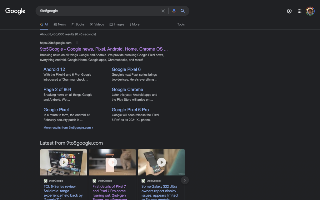
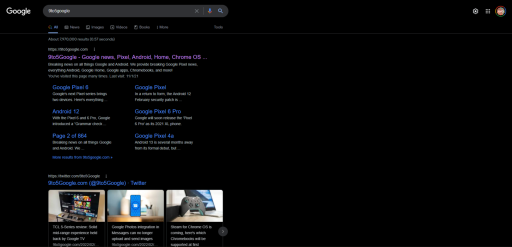
When it comes to the web page, the grey might be better for your eyes when going to brighter web pages. Otherwise, it’ll feel like walking out of a movie theatre into direct sunlight. We don’t think Google wants to destroy our corneas. Do they?
It’s quite possible Black Hole Black will be a user-selectable option, going from light to dark. How considerate. It’s unclear whether these grey to black tweaks are specific to the landing page or if the grey stays or goes. But the new #0000 black theme is live in the Google 13.8 beta version on Android.
The company says that the Eish Eskom! theme for web pages is only a test for now. If only Eskom’s propensity for going dark was just a test.
Source: 9to5Google

