
Twitter’s new desktop design has turned up and the word ‘hate’ has crossed our minds. Maybe hate is a strong word. It’s probably more akin to ‘dislike’, if we were pressed on the topic. Even though there have been rumours in the Twitterverse about a coming desktop redesign, we can’t get ourselves to feel comfortable with it just yet.
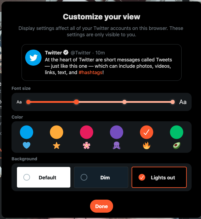
Twitter revealed its new look today, and the social network reckons it’s designed to conform with its mobile app design. Which means bigger fonts and more intrusive sidebars. The only good thing is likely the customisability of the platform — you now have the choice of ‘Dark’ mode (finally) and ‘Dim’ mode, along with the bleak Twitter white-and-blue.
Once you go New Twitter…
“Today, we are starting to roll out a new Twitter.com – a refreshed and updated website that is faster, easier to navigate and more personalised. The site has an updated look and feel that is more consistent with the Twitter you see on other devices, making it easier to access some of your favourite features, and with more options to make it your own.,” Twitter said in a statement. They’re far more cheerful about it than we are. But there are some neat little changes.
 The ‘Explore’ tab is now also available on desktop, making it easier to find live videos and local moments based on your location. Bookmarks, lists and your profile can be accessed directly from the massive side navigation menu. DMs now have a larger view, which allows you to respond to messages and see convos on the same screen.
Even though we’re not convinced yet, we’re sure the internet will grow to love the new design. It is rolling out gradually now, but if you don’t have it yet, you can go ahead and try it by clicking on your avatar and selecting “Try the new Twitter.”
A fair warning: once you go new Twitter, you don’t go back.
Source: Twitter


