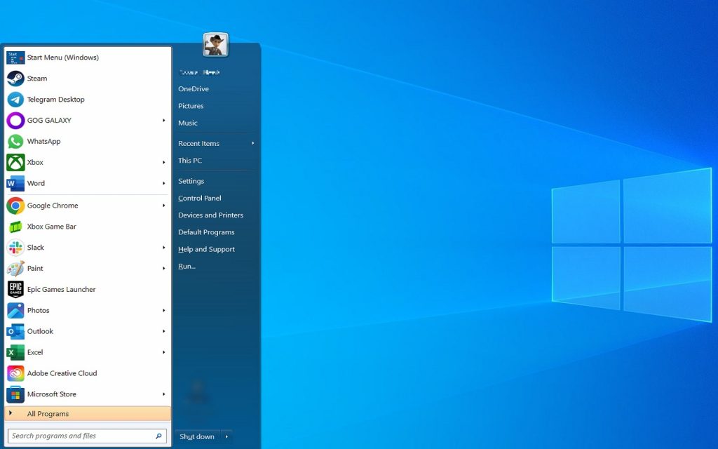
For reasons unknown, Microsoft has insisted on changing the Windows Start Menu in every version of Windows they’ve developed since Windows 7. And every time they’ve changed it, they’ve made it worse. From Windows 8’s ill-fated Start Screen that nobody liked, to Windows 11’s far too Apple-like Start Menu, Microsoft still hasn’t found the middle-ground that would please both long-time Windows users and new users.
This is because thousands of people in the business world used Windows prior to 2013. They became accustomed to the operating system’s design language and were not huge fans of change. While Windows XP’s colourful look and bright green Start button could be classified as “change”, the OS’s fundamentals remained the same: Start was in the lower left corner, you clicked on it, and a menu that made sense appeared.
Now, we have Windows 10 and Windows 11, both of which have tried – and failed — to reinvent the Start Menu. Perform a quick search for “windows 11 start menu sucks”, and you’ll come across forum and social media comments like “the Windows 11 Start Menu remains an unfinished and disorganised mess”. Don’t get us started on the travesty that was Windows 8’s ‘Start Screen’.
Clearly, there is still a lot of mileage left in the old pre-Windows 8 Start Menu design.
How do we know this? Because Start Menu replacement apps exist. And not just one, either – there are several to choose from if you want to restore Start Menu perfection, aka the Windows 7 Start Menu. Some ask you to pay for them while others ask for nothing, but they all do one vital thing: they bring back a simple, elegant, and genuinely easy-to-use Start Menu. No fluff, no tiles, no ads, no news – just good old-fashioned access to the things on your computer.
Seriously, Microsoft, just stop with the new Start Menus. You nailed it years ago, just refine that and you’ll please a lot more people than your overpaid UI designers are pleasing today.
How to replace your Start Menu
All of that aside, here’s how to replace your Start Menu. I use Open Shell, a new open-source fork of the original Classic Shell, and it’s brilliant. It’s safe to download and use, it’s completely free, and it brings back Windows 7’s Start Menu in all its glory, with tons of customisation options added in for good measure.
All you need to do is:
- Go to https://open-shell.github.io/Open-Shell-Menu/
- Download the latest stable version (OpenShellSetup_4_4_191.exe)
- Run the program
- Follow the prompts to install it
Now, you can customise the Start Menu by:
- Right-clicking on the Start Menu button and choosing Settings
- Click on the Start Menu Style tab
- Choose between Classic, Classic With Two Columns, and Windows 7 Style (Hint: Windows 7 Style is best)
And you’re done. This works on both Windows 10 and Windows 11, giving you a brilliant Start Menu no matter your OS.
We highly recommend digging into the myriad customisation options offered by Open Shell, as it gives you the power to tweak your Start Menu to your heart’s content. Our favourite tweaks are to make the Control Panel use the Categories view (find it under the Main Menu tab towards the bottom) and to make the Control Panel display as a link (that’s under Customize Start Menu).
Start11
We don’t know why Start11 exists, to be honest, because it charges R224 for Start Menu replacement software that does something similar to what Open Shell offers for free. Check it out if you want to (there’s a free trial), but honestly, you’re better off buying six of your closest friends a cup of coffee with the money instead.
Enjoy your new Start Menu
Replacing the stupid Start Menu with Open Shell is the first thing I do on any new PC I get access to, and I strongly encourage you to do the same. From a business perspective, familiarity means productivity, so you could even roll Open Shell out company-wide for a slight boost to your staff’s morale and output.
Obviously not everyone is going to share our opinion on what Microsoft is doing with modern Start Menu design, but if you’re not a fan then we hope this has helped you in a small way by making you realise that, at the very least, you’re not stuck with it.
Happy Windows 7 Start Menu-ing!
