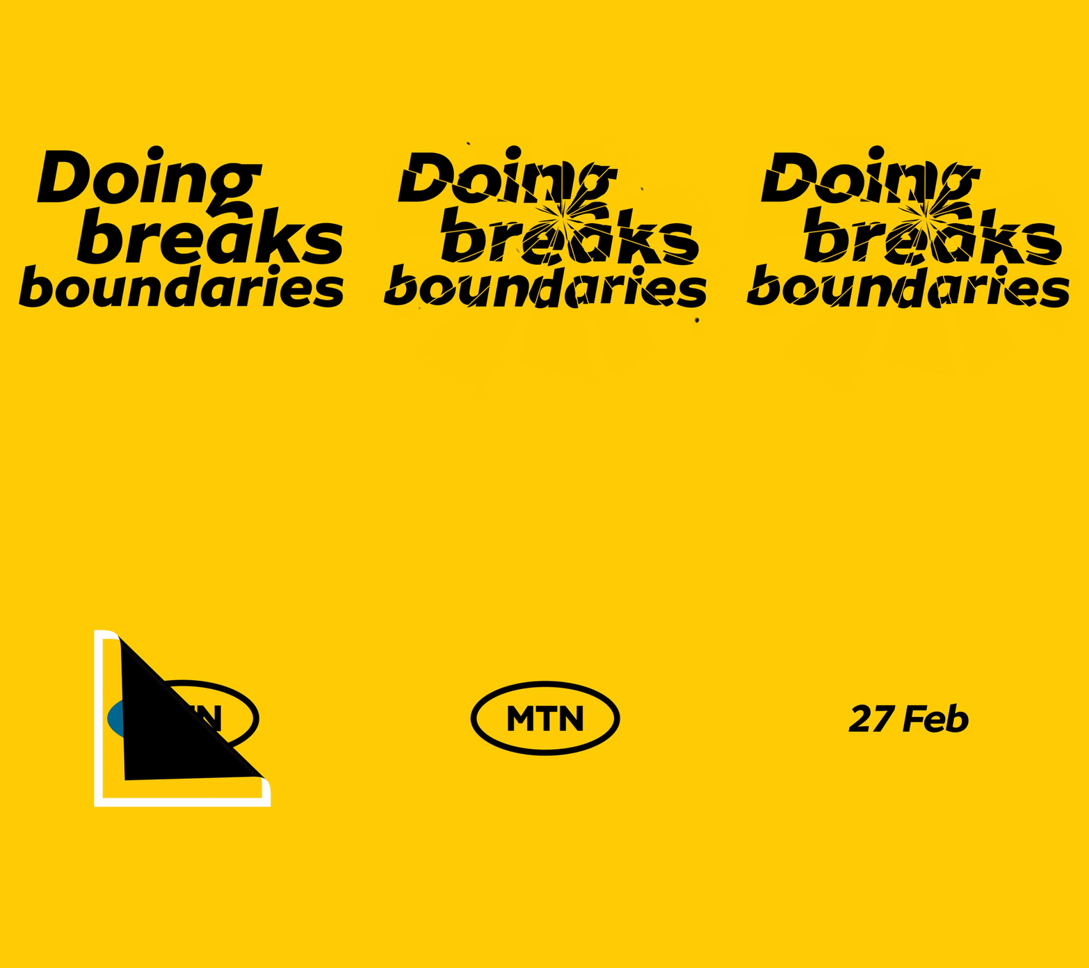
MTN is about to launch a major rebranding campaign on 27 February 2022. And by major rebranding, we mean slightly changing its logo and typeface.
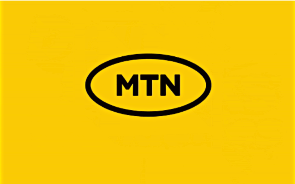
The new look is already on display outside MTN’s offices in Roodepoort, Gauteng. It’s opted for a much more simplistic look. Gone is the white and yellow text with a red accent, the blue oval and white border.
This time around, the telecoms company has opted for a two-tone approach. The blue block letters ‘M, T and N’ are bordered by a blue oval on an all-yellow background. But wait, there’s more.
The old tagline “Everywhere you go” is out and the new, but still recognisable, “Y’ello” replaces it.
New year, new MTN

In an official statement, the company tries to justify the rebrand by explaining how tenses work. “The campaign is inspired by an insight that doing is a bridge between can and done,” the statement reads. We checked our notes and it’s correct. The present participle ‘doing’ does indeed come between the modal auxiliary ‘can’ and the past tense ‘done’.
According to the statement, the new look “is aligned to our evolution from a telecommunications company to a technology company underpinned by one simple, consistent, yet striking brand.”
Let’s hope this new brand brings with it new price cuts to data bundles like the company did last year. We’re big fans of those.


