


It’s hard to believe Google’s still only a teenager. It’s look has come a long way over the past 17 years, as has the range of products and services it offers. And it’s power, let’s not forget it’s enormous, culture-shaping power. From search to photo storage, mapping to self-driving cars and even plans to get remote areas online with high-altitude balloons, there are few areas of the digital world Google doesn’t have a hand in.
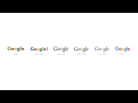
It’s all pretty amazing for a company that makes the bulk of its (rather substantial) income from advertising. Like any company that’s so public-facing, once in a while it needs a makeover. Wednesday saw Google unveil its new look via a Google Doodle and its blog. The update includes a refreshed logo that takes the flat, simple “material design” style that’s come to characterise its mobile operating system, Android, a new G for smaller devices like mobile phones and other animated bits and bobs.

So why now? “Once upon a time, Google was one destination that you reached from one device: a desktop PC. These days, people interact with Google products across many different platforms, apps and devices—sometimes all in a single day,” the company says in its blog post. “You expect Google to help you whenever and wherever you need it, whether it’s on your mobile phone, TV, watch, the dashboard in your car, and yes, even a desktop!
“Today we’re introducing a new logo and identity family that reflects this reality and shows you when the Google magic is working for you, even on the tiniest screens. As you’ll see, we’ve taken the Google logo and branding, which were originally built for a single desktop browser page, and updated them for a world of seamless computing across an endless number of devices and different kinds of inputs (such as tap, type and talk).”
Gone is the lowercase blue “g” icon the company previously used when quarters were cramped in favour of the new capital “G” that uses the same four colours of the full-sized logo. If you’re a type or logo fanatic and want to know more about the design decisions that went into the facelift there’s a pretty exhaustive blog post about it here.
Now if only the company would stop mucking about with trivial matters like its corporate identity and get back to important things… like jetpacks.